用css画一个蜡烛
你有女朋友吗?
程序员有一个鄙视链, 如下图所示:

所以,要想站在鄙视链的顶端, 就要想办法向上爬, 那么如果是想要突破这种情况的话, 就需要一些骚操作
你是否被人骂自己不够romantic?
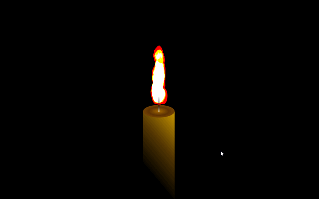
如果你生日的那天为女友画这样一个蜡烛, 那么大事可成。废话不多说, 直接上效果:
那么下面我们就一起来操作一下吧
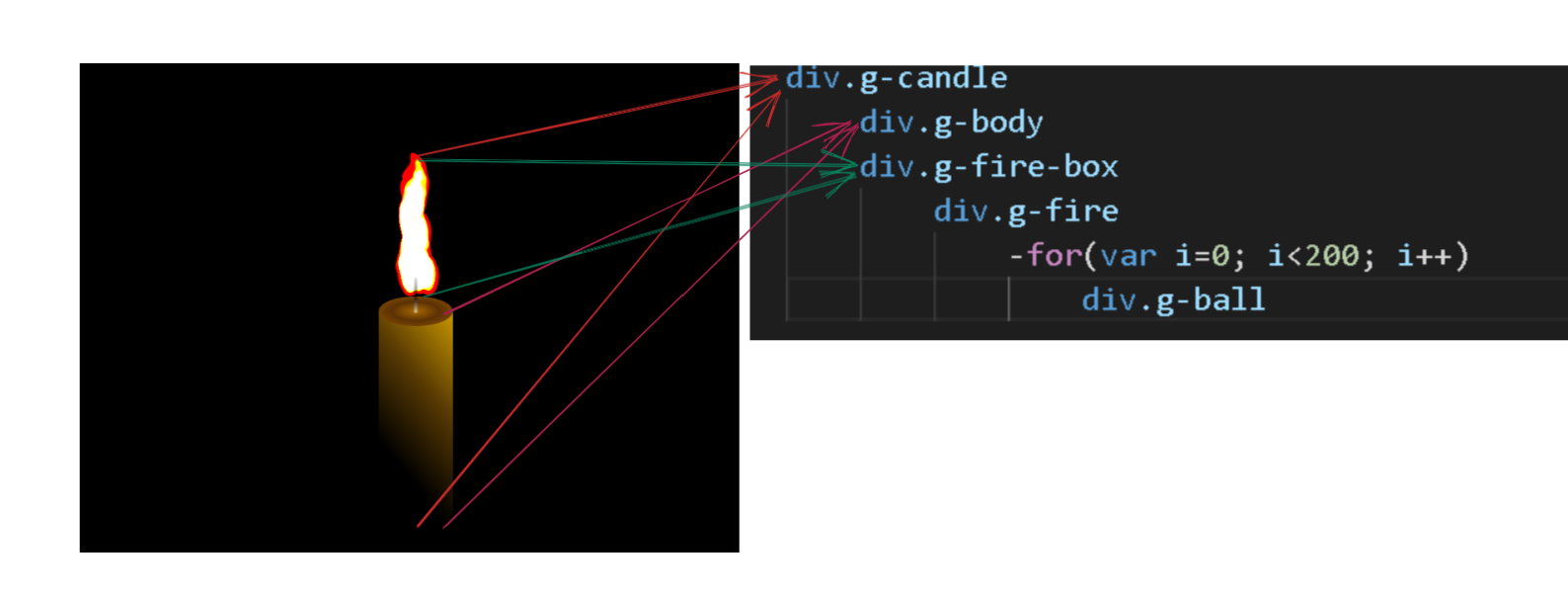
结构
1
2
3
4
5
6
| div.g-candle
div.g-body
div.g-fire-box
div.g-fire
-for(var i=0; i<200; i++)
div.g-ball
|
简单的分析一下结构
其实结构看起来还好, 但是最麻烦的还是css, 但是, 为了女神, 有什么麻烦的呢?
开始
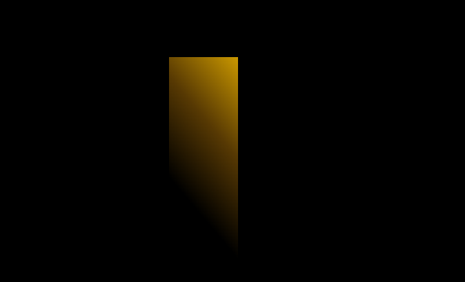
绘制蜡烛
我们先要画出这样一个效果:
这部分用到的代码就是:
1
2
3
4
5
6
7
8
9
10
11
12
13
14
15
16
17
18
19
20
21
22
23
| html, body {
height: 100%;
background: #000;
overflow: hidden;
}
.g-candle {
position: absolute;
width: 400px;
height: 400px;
top: 50%;
left: 50%;
transform: translate(-50%, -50%);
}
.g-body {
position: relative;
width: 100px;
height: 300px;
margin: 280px auto;
background: linear-gradient(230deg, #ca9800, #573903, black 70%);
z-index: 1;
}
|
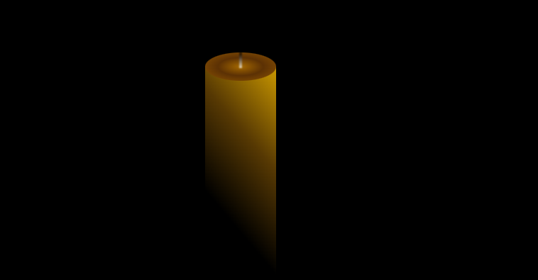
这个是主体的g-boby部分,但是想实现顶部的那个盖, 和上面的灯芯, 我们不妨用一下伪类来制造这样一个效果:
1
2
3
4
5
6
7
8
9
10
11
12
13
14
15
16
17
18
19
20
21
22
23
24
| .g-body::before {
position: absolute;
content: "";
width: 100px;
height: 40px;
border-radius: 50%;
box-sizing: border-box;
top: -20px;
background: radial-gradient(#a46800, #5c3104 45%, #905602 100%);
}
.g-body::after {
position: absolute;
content: "";
width: 4px;
height: 48px;
background: #fff;
left: 50%;
top: -22px;
transform: translate(-50%, -50%);
border-radius: 50% 50% 0 0;
background: linear-gradient(180deg, rgba(0, 0, 0, 0.3) 0%, rgba(0, 0, 0, 0.8) 60%, #fff);
opacity: 0.7;
filter: blur(1px);
}
|
效果:
绘制火焰
火焰部分应该是最难的了, 我们用到了动画的知识, 具体思路就是让200个div以特定的形状以动画的形式往上动来模拟实现一个火焰燃烧的效果
我这里只列举10个:
1
2
3
4
5
6
7
8
9
10
11
12
13
14
15
16
17
18
19
20
21
22
23
24
25
26
27
28
29
30
31
32
33
34
35
36
37
38
39
40
41
42
43
44
45
46
47
48
49
50
51
52
53
54
55
56
57
58
59
60
61
62
63
64
65
66
67
68
69
70
71
72
73
74
75
76
77
78
79
80
81
82
83
84
85
86
87
88
89
90
91
92
93
94
95
96
97
98
99
100
101
102
103
104
105
106
107
108
109
110
111
112
113
114
115
116
117
118
119
120
121
122
123
124
125
126
127
128
129
130
131
132
| .g-fire {
position: absolute;
top: 30px;
left: 50%;
border-radius: 45%;
box-sizing: border-box;
border: 120px solid #000;
border-bottom: 120px solid transparent;
transform: translate(-50%, 0) scaleX(0.45);
background-color: #761b00;
}
.g-ball {
position: absolute;
top: 60px;
transform: translate(0, 0);
background: #fa8763;
border-radius: 50%;
z-index: -1;
mix-blend-mode: screen;
}
.g-ball:nth-child(1) {
width: 24px;
height: 24px;
left: calc(40px - 55px);
}
.g-ball:nth-child(1) {
-webkit-animation: movetop 1s linear -2.137s infinite;
animation: movetop 1s linear -2.137s infinite;
}
.g-ball:nth-child(2) {
width: 21px;
height: 21px;
left: calc(11px - 55px);
}
.g-ball:nth-child(2) {
-webkit-animation: movetop 1s linear -2.244s infinite;
animation: movetop 1s linear -2.244s infinite;
}
.g-ball:nth-child(3) {
width: 13px;
height: 13px;
left: calc(4px - 55px);
}
.g-ball:nth-child(3) {
-webkit-animation: movetop 1s linear -2.745s infinite;
animation: movetop 1s linear -2.745s infinite;
}
.g-ball:nth-child(4) {
width: 47px;
height: 47px;
left: calc(44px - 55px);
}
.g-ball:nth-child(4) {
-webkit-animation: movetop 1s linear -2.927s infinite;
animation: movetop 1s linear -2.927s infinite;
}
.g-ball:nth-child(5) {
width: 23px;
height: 23px;
left: calc(36px - 55px);
}
.g-ball:nth-child(5) {
-webkit-animation: movetop 1s linear -1.158s infinite;
animation: movetop 1s linear -1.158s infinite;
}
.g-ball:nth-child(6) {
width: 23px;
height: 23px;
left: calc(16px - 55px);
}
.g-ball:nth-child(6) {
-webkit-animation: movetop 1s linear -0.791s infinite;
animation: movetop 1s linear -0.791s infinite;
}
.g-ball:nth-child(7) {
width: 47px;
height: 47px;
left: calc(25px - 55px);
}
.g-ball:nth-child(7) {
-webkit-animation: movetop 1s linear -1.914s infinite;
animation: movetop 1s linear -1.914s infinite;
}
.g-ball:nth-child(8) {
width: 22px;
height: 22px;
left: calc(67px - 55px);
}
.g-ball:nth-child(8) {
-webkit-animation: movetop 1s linear -0.169s infinite;
animation: movetop 1s linear -0.169s infinite;
}
.g-ball:nth-child(9) {
width: 26px;
height: 26px;
left: calc(54px - 55px);
}
.g-ball:nth-child(9) {
-webkit-animation: movetop 1s linear -0.778s infinite;
animation: movetop 1s linear -0.778s infinite;
}
.g-ball:nth-child(10) {
width: 7px;
height: 7px;
left: calc(54px - 55px);
}
.g-ball:nth-child(10) {
-webkit-animation: movetop 1s linear -1.803s infinite;
animation: movetop 1s linear -1.803s infinite;
}
|
加上movetop的动画:
1
2
3
4
5
6
7
8
9
10
11
12
13
14
15
16
17
|
@keyframes movetop {
  0% {
    transform: translate(0, 0);
  }
  20% {
    transform: translate(0, 0);
  }
  87.7% {
    transform: translate(0, -170px);
    opacity: 0;
  }
  100% {
    transform: translate(0, -170px);
    opacity: 0;
  }
}
|
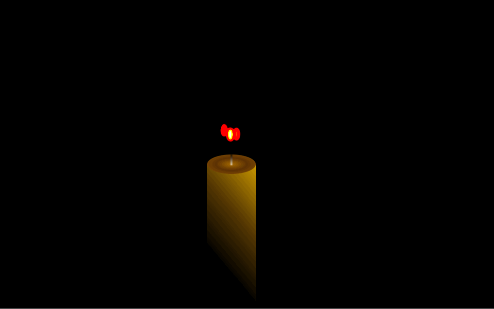
来看看10个的效果:
看看一百个动画的效果:
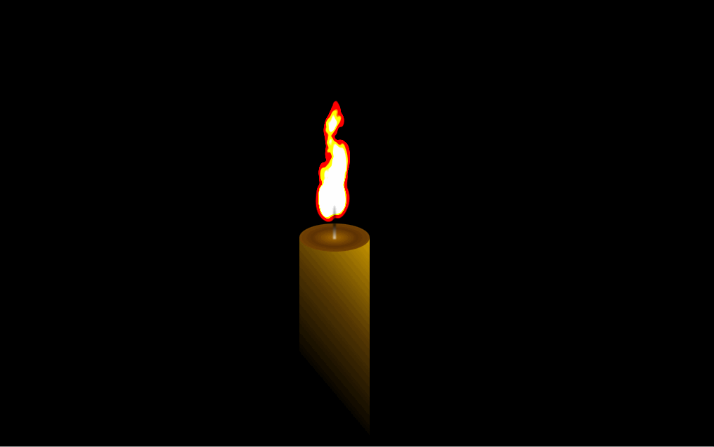
最后添加到200个就是刚开始的那种效果
怎么样, 是不是很酷?
如果你还有什么好的想法和意见, 欢迎评论哈哈哈